Aligning the inner contents in a Table column
Wherein I present a `colSpan=2` idea for TanStack Table when you want to line up verticaly something that is in the middle of the column’s cells.

Aligning a decimal point, or a currency symbol, or a date-time separating space, or some other content in the middle of table column, can be a little tricky sometimes. And when you’re using TanStack Table, it may not be straightforward to figure out how to do it. But here is how I did it with the first and last columns of this example:

(See my example in full at StackBlitz, or see my GitHub repository.)
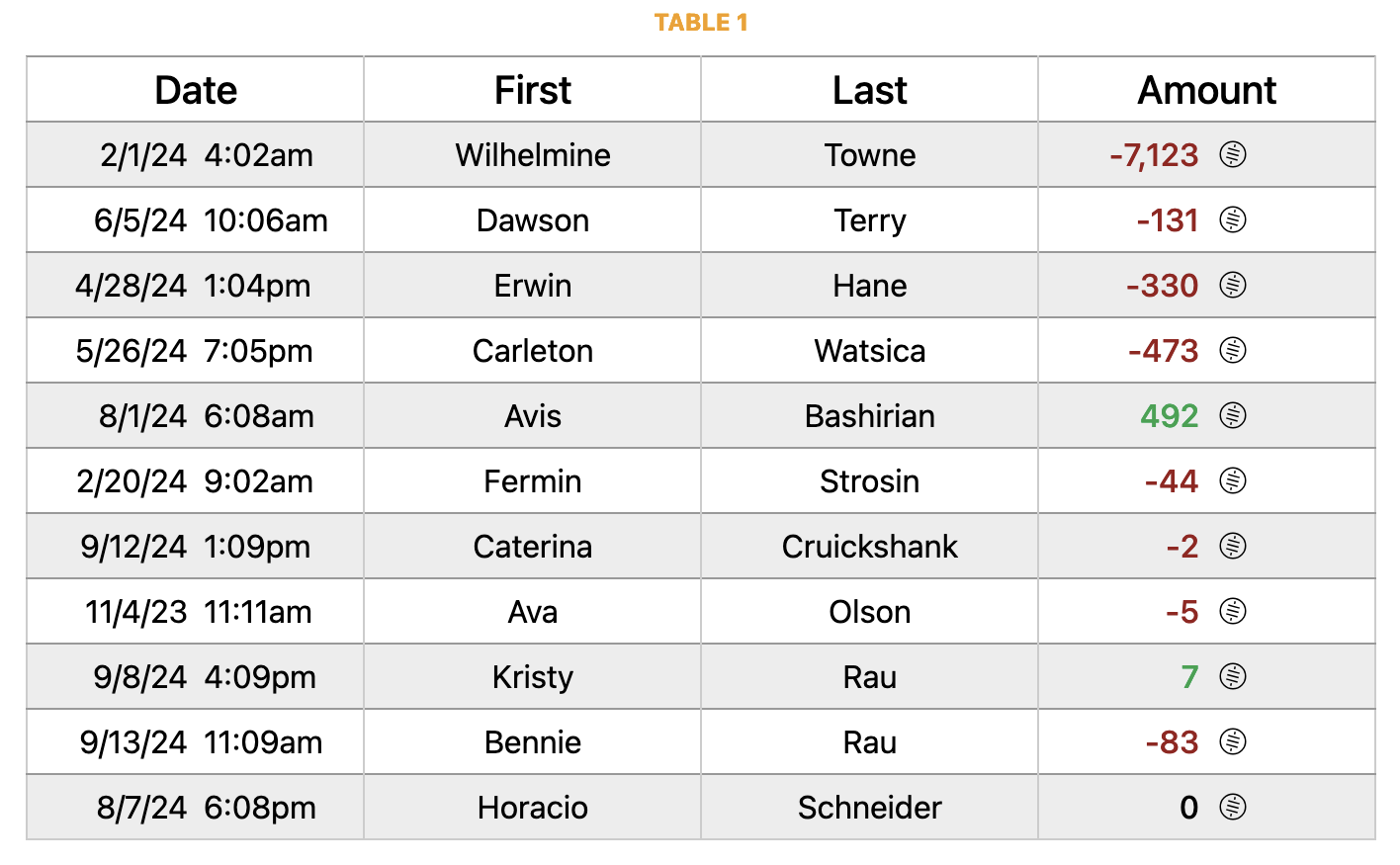
Table 1 is my intervention into the guts of a TanStack Table to create colSpan=2 in the table headers.
I couldn’t find any examples like this, but it yields a nice result, and that’s why I’m writing this blog post, in case it helps you, dear reader.
Note that the Date and Amount columns are actually 2 columns wide, to get the middle of the contents to align vertically in what appears to be a single column with a single header.
On StackBlitz, toggle the Highlight Alternating Columns checkbox to see what’s what with the columns.
All 4 columns are sortable by clicking the header.
- The Date column sorts by the date, and both of its columns have the same source because they are the same data, formatted differently. Because created_datetime is an ISO string, we sort by text, not by datetime.
- The First column is simply a text column and is sortable by clicking the header.
- The Last column is also a text column and is sortable by clicking the header.
- The Amount column sorts token_amount before any formatting is done to it, so it’s sorted as a basic. It doesn’t come with an icon or any currency information. The sats icon is added to every row.
In the first of two code excerpts from the repository you can see on StackBlitz, here is where I have added in the two additional columns:
const columns = [
  columnHelper.accessor("created_datetime", {
    header: () => "Date",
    cell: (info) => (
      <div className="text-right">
        <DateCell date={info.getValue()} format="M/D/YY" />
      </div>
    ),
    sortingFn: "text",
  }),
  columnHelper.accessor("created_datetime", {
    id: "created_datetime2", // <-- 2nd column for Date  //
    cell: (info) => (
      <div className="text-left">
        <DateCell date={info.getValue()} format="h:MMa" />
      </div>
    ),
    enableSorting: false,
  }),

  columnHelper.accessor("firstName", {
    header: () => "First",
    cell: (info) => info.getValue(),
    sortingFn: "text",
  }),

  columnHelper.accessor("lastName", {
    header: () => "Last",
    cell: (info) => info.getValue(),
    sortingFn: "text",
  }),

  columnHelper.accessor("token_amount", {
    header: () => "Amount",
    cell: (info) => <AmountCell amount={info.getValue()} />,
    sortingFn: "basic",
  }),
  columnHelper.display({
    id: "token_amount2", // <-- 2nd column for Amount  //
    cell: () => <Sats />,
    enableSorting: false,
  }),
];
And, to wrap this up, here’s an excerpt showing the key piece of code in the table header to make this happen:
<thead>
{table.getHeaderGroups().map((headerGroup) => (
  <tr key={headerGroup.id}>
    {headerGroup.headers.map((header) => {
      const colSpan2Headers = ["created_datetime", "token_amount"];
      const hiddenHeaders = ["created_datetime2", "token_amount2"];
      const isColSpan2Header = colSpan2Headers.includes(header.id);
      const isHiddenHeader = hiddenHeaders.includes(header.id);

      if (isHiddenHeader) return null;

      return (
        <th
          className={
            header.column.getCanSort()
              ? "cursor-pointer select-none"
              : ""
          }
          colSpan={isColSpan2Header ? 2 : undefined}
          key={header.id}
          onClick={header.column.getToggleSortingHandler()}
          style={{ width: `${header.getSize()}px` }}
        >
          {flexRender(
            header.column.columnDef.header,
            header.getContext()
          )}
          {{
            asc: "\u00A0↑",
            desc: "\u00A0↓",
          }[header.column.getIsSorted() as string] ?? null}
        </th>
      );
    })}
  </tr>
))}
</thead>
Hope this helps!
(Again, see a working example at StackBlitz, or see the code at my GitHub repository.)
